
Your online center for all things die variety
The Mystery of the 1974-S Mintmark Punch
A San Francisco mintmark punch used in the '40s and '50s reemerged decades later.
By Will Brooks
Photos by Ray Parkhurst
The long-used industry standard for identifying the different mintmark styles used over the years was established by Dr. James Wiles and can be seen at his website, www.varietyvista.com.
In the November, 2018 issue of Coin World Monthly, I explained the features of the San Francisco mintmark style listed by Dr. Wiles as MMS-009 (Mint Mark Style-009). According to Wiles' listings, this punch came into service in 1974 and was used until 1979. This was a bad-looking punch which had a series of defects. Assuming that this punch was brought into service in 1974, I concluded in that article that this punch must have been made with those defects and that they were not the result of the punch's deterioration from over-use. I have since discovered that this is not entirely true.
From doing that study, the many subtle nuances of the MMS-009 mintmark had become ingrained in my mind's eye. Recently, while looking over some 1942-S "wheat" cents, I suddenly noticed something quite profound. These cents had the same mintmark as 1974-S cents minted 32 years later! I examined many more examples. Sure enough, with the exception of a couple of the defects on the upper curl and serif, the San Francisco mintmark punch listed by Dr. Wiles as MMS-004, which was used off and on from 1941 to 1952, looked identical to the one labeled MMS-009. It suddenly all made sense to me as to why the MMS-009 punch looked so bad at the onset in 1974 and very quickly deteriorated into a "blob" by 1977. It is because by 1974, this punch was actually already over 30 years old and had been used extensively for over a decade in the '40s and '50s!
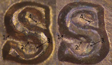
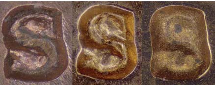
Comparing mintmarks to show definitively their similar characteristics is much more of a challenge than comparing other design features. There are many variables at work which can alter the appearance of mintmarks, despite their being made by the same punch. Before 1990, all business-strike dies had their mintmarks punched into them by hand; therefore, the depth of each individual punching can vary pretty dramatically. This can change both the overall size and appearance of the mintmark. It is important to look at the "flat" apex of the mintmark's tallest surfaces. These will not change with varying depth of punch like the wedge-shaped slopes that border it on all sides will. Furthermore, any difference in the angle of incidence of the punch in relation to the die can also affect its consistency top to bottom, or left to right. We also have to account for damage and wear on the punch as it was used year after year. On top of all of that, die state can also have an impact on its appearance as well as any contact marks present. So, we had to take all of these factors into account when doing our comparisons.
In addition to the fact that the mintmarks on 1942-S cents and 1974-S cents were of the same font and identical size, we were also able to identify several shared unique characteristics, which I call "punch markers." In addition to the strange bulge and cavity on the center "horizontal," they also shared identical ridge lines inside the upper and lower loops at what would be the deepest recesses of the punch. The only difference between them was that the specimens from the '40s and '50s did not have the "split" on the upper curl and serif that it apparently developed during its use in 1974.
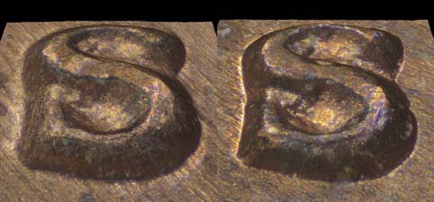
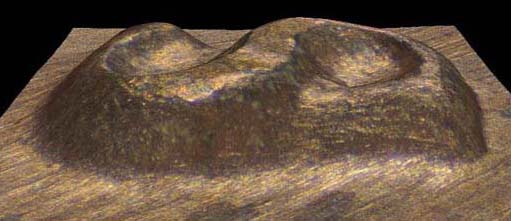
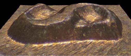
When looking down at this mintmark from above and seeing it in 2 dimensions, this defect on the upper curl and serif really does appear to be doubled, leading some to believe it was a newly made doubled punch; however, when viewed from the side in 3 dimensions, we can see it isn't really a "split" at all, rather a "cliff" between two different layers of relief. This "doubled curl" is not made from new extra material at all, rather it is actually formed out of the Northern slope of the existing punch.
We also found an in-between stage on some 1974 examples that showed the split on the upper serif beginning before the break on the upper curl happened. Therefore, we know it didn't happen all at once. This is a strong indicator that the punch became damaged and was neither a new doubled punch nor a reworking of the existing punch. In any event, it was a short-lived stage as this break quickly eroded away into the big slope to the North, leaving only a very thin apex for an upper curl, like we see on proof coinage in the subsequent years after 1974. What I had originally thought was slide Machine Damage, is actually just various stages of erosion of that break into the Northern slope of the mintmark.
It is quite understandable that this mintmark punch was not recognized in 1974. First, the strong, newly developed defects on the upper curl and serif mislead observers. Second, the punch depth in 1974 was most often quite deeper than the examples we see in the '40s and '50s. This will change the overall size of the mintmark. Third, in those days, we could really only get a two-dimensional look from above at mintmarks. With modern advances in photography, we are able to get a new perspective with three-dimensional rendering. This gives us a great advantage. Finally, who would even expect a punch to come back into service after 22 years? We can only imagine why. Perhaps when the MMS-008 used for the first part of 1974 broke this was all they had around. It is another mystery to which we will likely never know the answer.
After completing this study, I notified Dr. Wiles of our findings. After graciously taking the time to review our work, he has agreed to update his listings.
| Who would even expect a punch to come back into service after 22 years? |